qingyu068@gmail.com
QINGYU © 2025
.svg)

menu
close


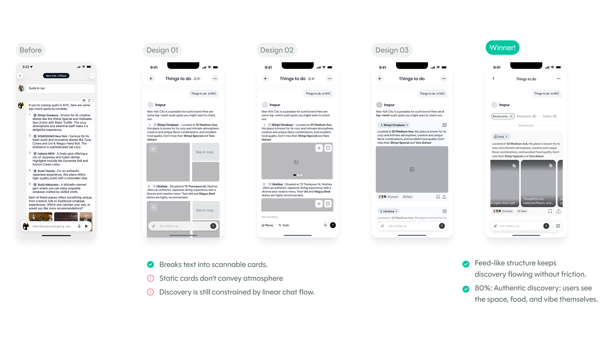
"I didn't know what to do when I opened the app — there were too many things happening at once."
"The AI just gave me a list. I wanted to see it, understand why, and then go."
"I found a place I liked but then had to figure out where it was separately. It should just show me."
I worked with engineers to validate feasibility and backend data support, and with AI experts to refine chat interactions, ensuring designs were both user-friendly and technically achievable.

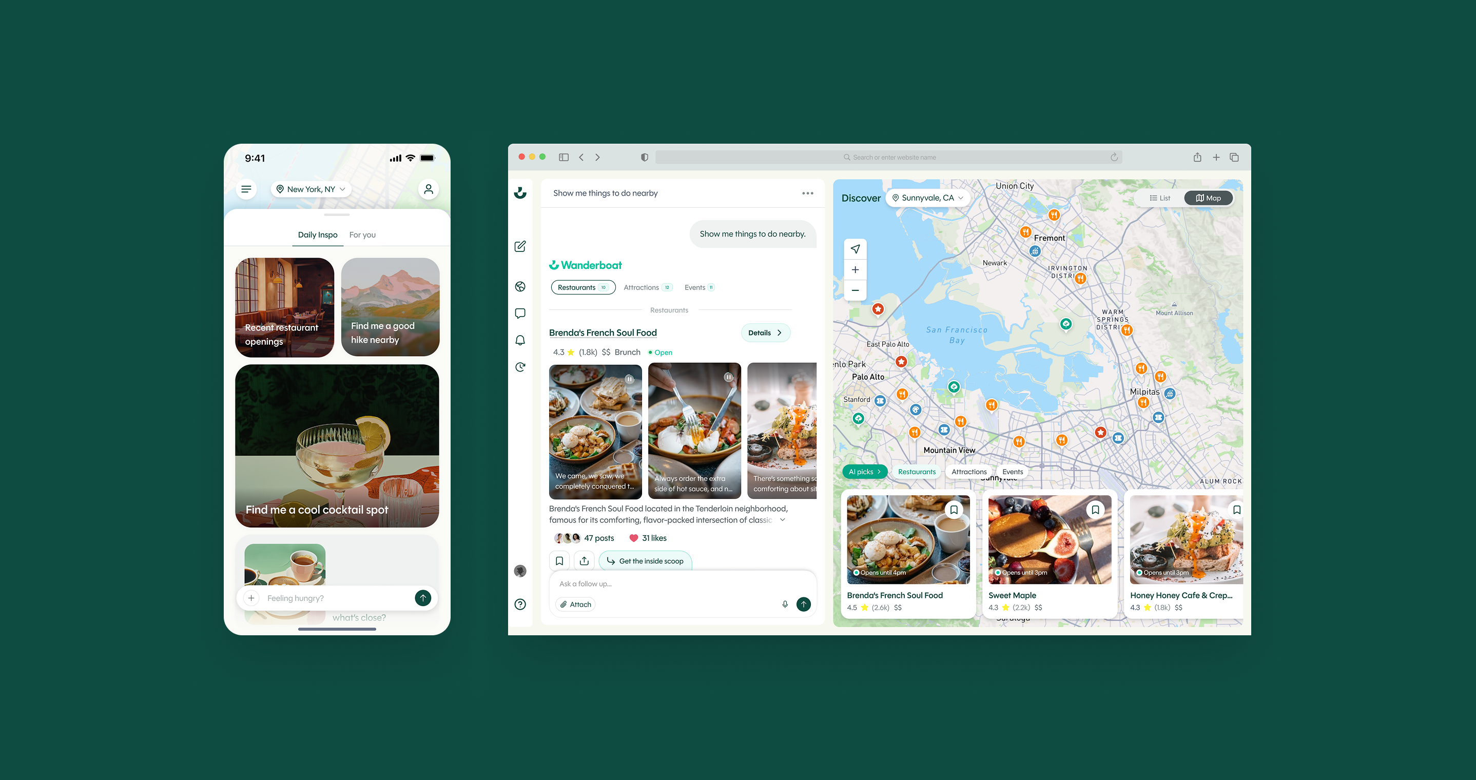
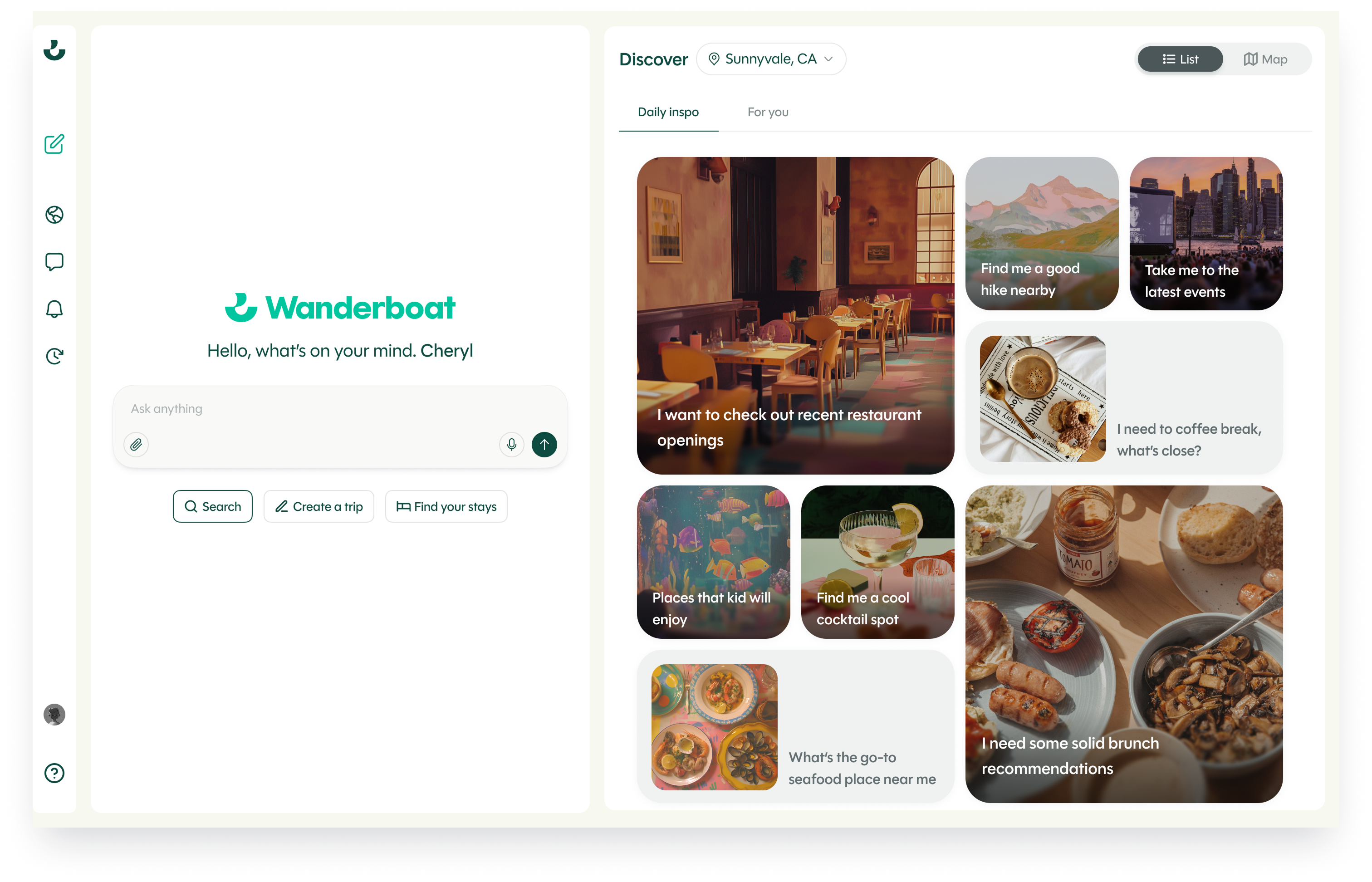
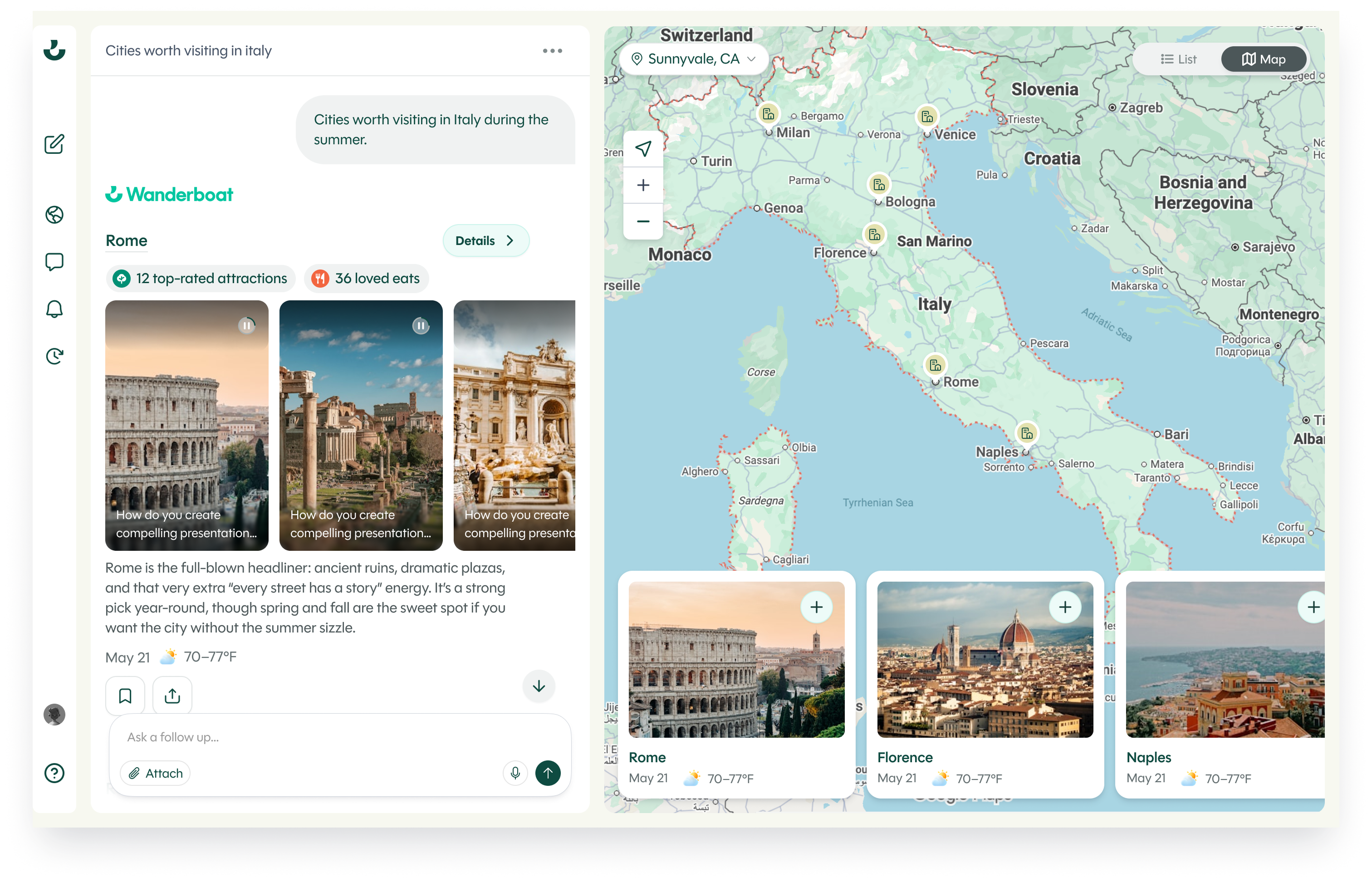
The homepage was redesigned with contextual prompts, visual hierarchy, and personalised suggestions to guide users toward exploration.
Solves: AI's role was unclear — users didn't know where to start.
Replaced long text summaries with short scannable cards, and brought the map and user content into one surface.
Solves: text-heavy responses reduced engagement — users read instead of explored
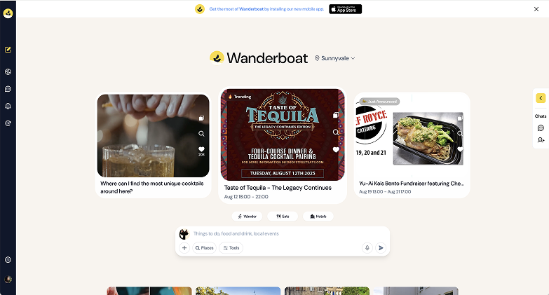
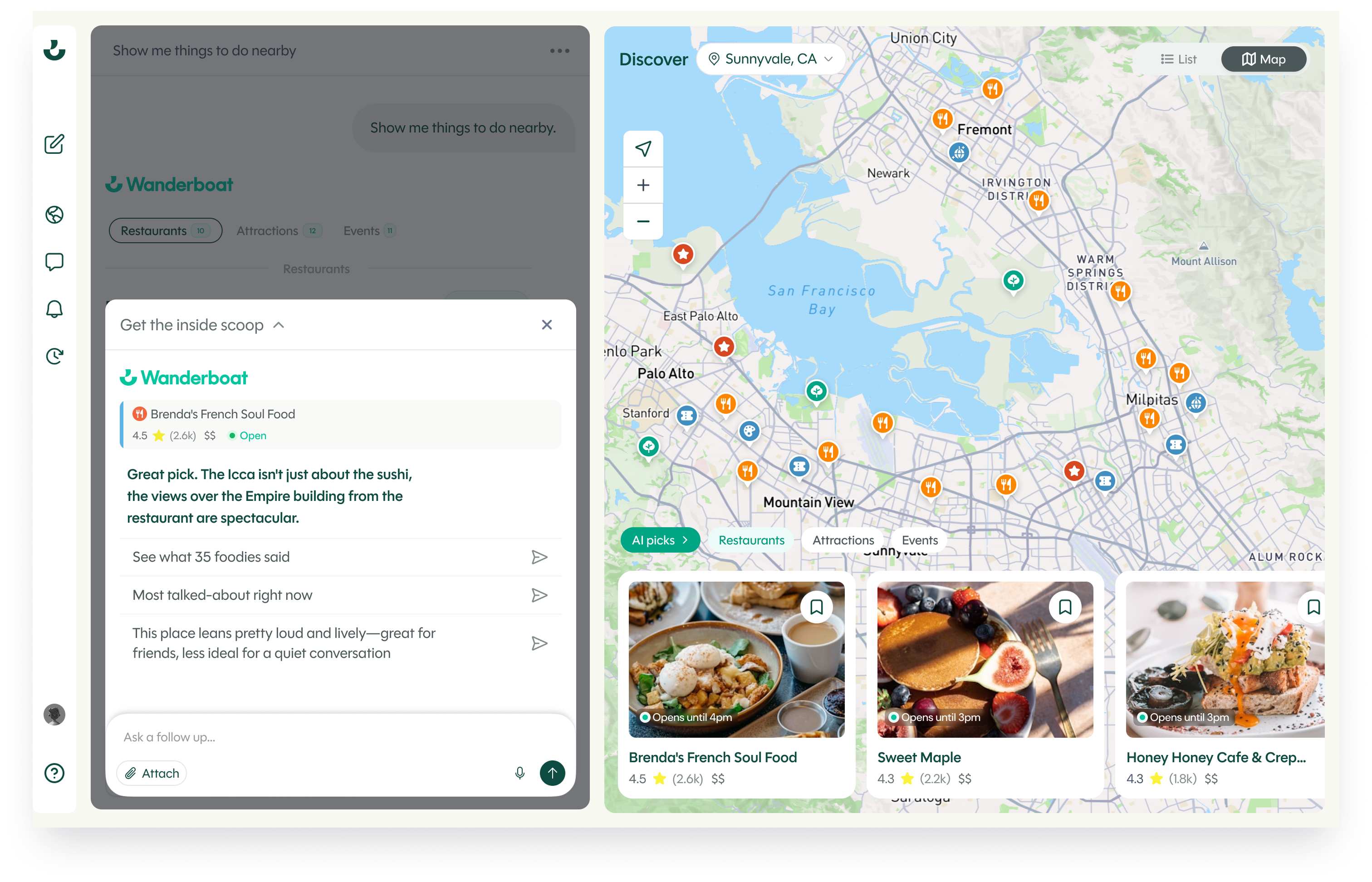
Deep Dive opens a focused AI conversation scoped to a single recommendation. Same visual context, no
scroll loss, no thread pollution. AI engagement depth where users already are.
Solves: even with richer results, users still had lightweight follow-up questions about specific places — "Is it good for a date?", "How loud is it on weekends?" — but asking in the main chat meant losing scroll context and getting a generic response disconnected from the card they were looking at.
Designed and documented a unified component library such as buttons, color tokens, toasts and alerts — spanning web and iOS.
Solves: inconsistent UI across web and iOS slowed the team down and made the product feel unpolished

.webp)