AI Trip Planner

An AI-powered trip planner that transforms recommendations into an interactive, map-based workspace, helping users go from inspiration to a structured itinerary. Instead of a static plan, users can easily explore, adjust, and organize their trip in real time.
AI Planner
Spatial UX
Trip Workflow
My Role:
Product Designer
Status:
Launched on Desktop, iOS and Android
Timeline:
Nov 2025 - Feb 2026
Team:
1 Product designer, 2 Visual designers, 1 Product manager, 2 AI Engineers, 5 Developers
Deliverables:
  • 0→1 AI Trip Planner Experience (Web & Mobile)
  • Defined the end-to-end user flow across chat, map, and itinerary views, partnering with cross-functional teams to establish scalable interaction patterns and reusable components.
  • Conducted user research to guide decisions.

North star metric

53%
of users who generate a trip and return to view or interact with it

01 - BACKGROUND

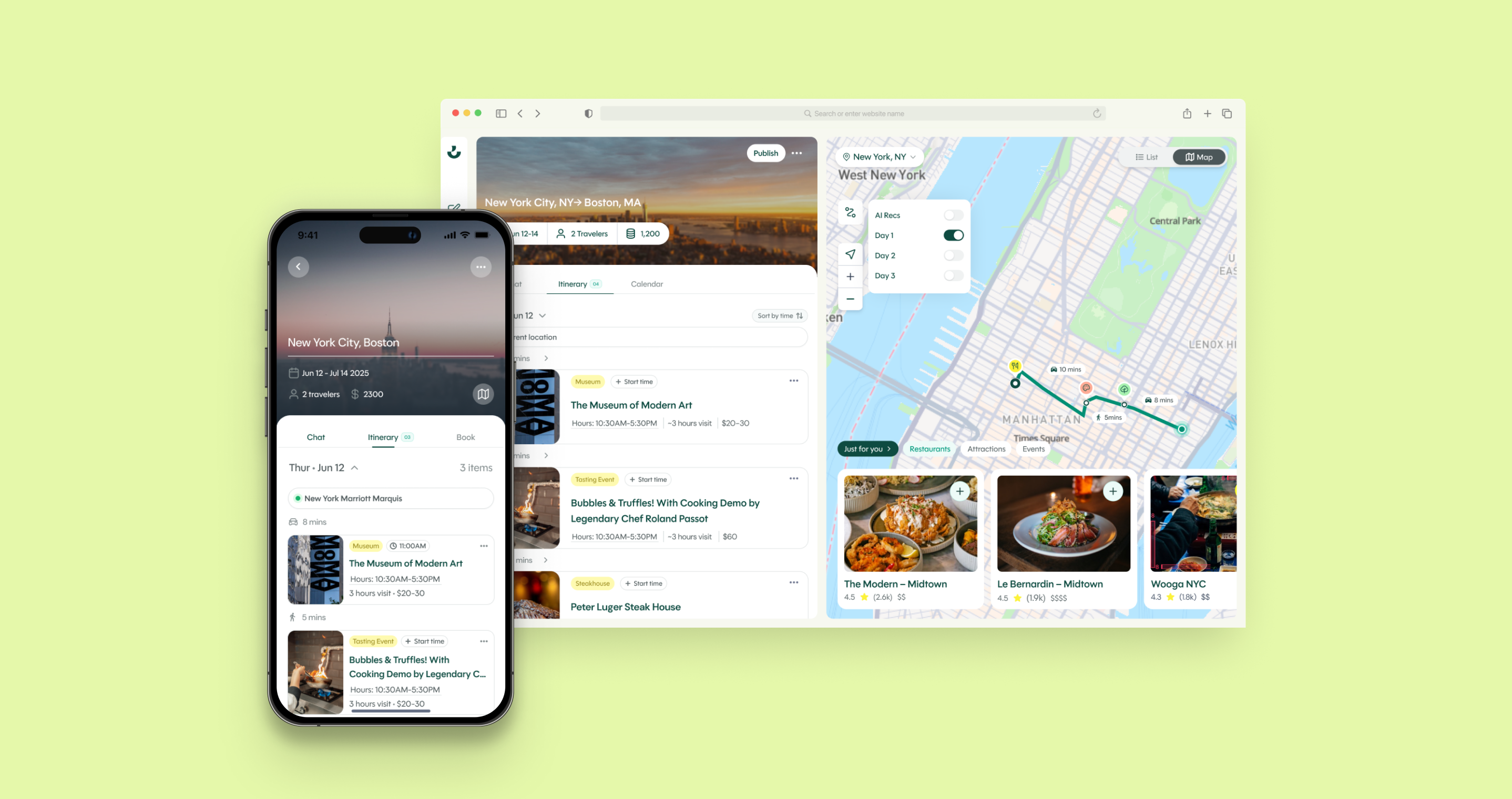
Wanderboat is an AI-powered local discovery platform. Users chat with an AI to explore destinations, find restaurants, and get local recommendations. The trip planner was an early feature — built as a standalone utility that used AI to generate a multi-day itinerary.

The original planner

A one-off utility buried in navigation. AI would generate a read-only itinerary — no editing, no context from your conversation, no way to iterate. Once generated, it was a dead end.

Why it mattered to fix

Trip planning is Wanderboat's highest-value use case. If the planner isn't discoverable or useful, the product is missing its clearest opportunity to create lasting value for users.

02 - PROBLEM

Discoverability

The planner lived deep in navigation with no contextual triggers. Users actively exploring cities and asking for recommendations in chat had no reason to know a planner existed. The function was hard to find and its purpose wasn't obvious.

Static output

Once the AI generated an itinerary, it was frozen. Users couldn't edit stops, change dates, reorder days, or refine anything. There was no connection back to the chat to ask follow-up questions. The experience ended the moment it was created.

Disconnected from chat

The planner and chat were entirely separate. A user who spent 20 minutes talking to the AI about Tokyo would have to start over from scratch in the planner — none of that context carried over.

03 - WHAT WE HEARD

We ran user interviews to understand how people currently approach trip planning and what they expected from an AI-assisted tool. This was genuinely new territory — no prior benchmarks existed for this type of feature, which shaped how we approached both research and scoping.

Users expected to own their itinerary

"Once it's generated, I want to move things around, swap a restaurant, change the day order — it's my trip, not a fixed schedule."
Users saw AI generation as a starting point, not a final answer. The expectation of editability was near-universal — they wanted to tweak, not just receive.

Planning with others was a strong desire

""I always plan trips with my partner or friends — I'd want to share it and have them add things too"
Collaboration came up consistently across participants who plan group or couples trips. Users imagined shared editing, commenting, or at minimum — a shareable link.

Logistical intelligence and spatial optimization

"It gave me a morning spot in the north, lunch in the south, then an afternoon thing back in the north. I'd never actually do that — why would the AI?"
A zigzagging route or an impossible back-to-back schedule wasn't just inconvenient — it made the entire output feel untrustworthy. Spatial grouping and realistic pacing were the silent baseline for credibility.

Planning with others was a strong desire

"I always plan trips with my partner or friends — I'd want to share it and have them add things too"
Collaboration came up consistently across participants planning group or couples trips — shared editing, commenting, or at minimum a shareable link.

04 - Pain points → design responses

Not every insight became a shipped feature. Here's how we mapped findings to decisions.

Pain

Planner was impossible to find — users didn't know it existed.

Shipped

Two entry points: chat-triggered CTA + prominent home screen action.

Pain

Static output — users couldn't adjust after generation.

Shipped

Users can continue refining via chat after viewing the generated plan.

Pain

One of the highest-friction parts of trip planning is geography and timing.

Shipped

Stops grouped by neighbourhood, the map view makes spatial logic visible and verifiable at a glance.

Pain

Want to plan collaboratively with friends or a partner

Deferred

Real-time collaboration requires significant infrastructure — scoped out of this release, flagged as v2 north star

05 - Design solution

What we built

Two complementary entry points now meet users where they are — in conversation and on the home screen.

Discover

Chat triggers planning

Plan

Modal gathers intent

Experience

Map brings it to life

Scenario 01

Spontaneous planning from conversation

Problem: planner disconnected from chat

When a user expresses travel intent in conversation, a contextual prompt appears inline asking if they'd like a full trip plan. Generation happens in the background — the user stays in chat and a "View your trip" button surfaces when ready. The planner becomes a natural next step in the conversation, not a separate tool to navigate to.

Scenario 02

Intentional planning from home screen

Problem: no clear entry point to start planning

For users who arrive with clear intent, "Create a trip" on the home screen opens a focused setup modal designed to collect the right information upfront without overwhelming.
Destinations use a tokenized input for seamless multi-city planning. The AI toggle lets users choose how AI helps — full itinerary generation, or recommendation mode where they curate the plan themselves — supporting different planning styles without forcing a single mental model.

Scenario 03

Navigating the generated itinerary

Problem: static list with no spatial context

The generated itinerary opens as a split view, stops listed by day on the left, route map on the right. Tapping any stop highlights it on the map, making the spatial flow of the day immediately readable. The map isn't decorative; it's the primary way users verify the plan actually makes sense to navigate.